Module 6 — How to Read a Dashboard
What is the dashboard really telling us — and what might we misunderstand?
Module Learning Objective
This module helps explain:
how healthcare dashboards should be interpreted critically — and why dashboards are often starting points for questions rather than endpoints for conclusions.
By the end of this module, readers should feel more confident asking:
What is this dashboard really telling us — and what might I be misunderstanding?
The module focuses on practical healthcare dashboards commonly used to monitor:
- Emergency Department (ED) activity
- emergency admissions
- elective recovery
- ambulance handover delays
- delayed discharge
- pathway performance
- population health and inequalities
- operational flow
Rather than teaching how dashboards are built, this module focuses on:
how dashboards should be interpreted
to support better questions and better decision-making.
Why Dashboards Matter
Healthcare systems increasingly rely on dashboards.
Every day, leaders across healthcare review information intended to support decisions about:
- demand
- operational performance
- quality
- access
- inequalities
- workforce pressure
- system improvement
Examples may include:
- Emergency Department performance dashboards
- elective waiting list dashboards
- ambulance handover dashboards
- discharge and flow dashboards
- population health dashboards
- inequalities dashboards
- pathway monitoring dashboards
Dashboards are powerful because they help simplify large volumes of information.
Instead of reading lengthy reports:
decision-makers can quickly see:
performance trends
variation
comparison
risk
areas requiring attention
However:
dashboards do not speak for themselves
A dashboard presents information.
It does not automatically explain:
why something happened
or
what should happen next
This distinction matters.
Because poor dashboard interpretation can lead to:
- overreaction to normal variation
- misleading conclusions
- poor investment decisions
- misplaced operational attention
- false reassurance
Good dashboard interpretation therefore asks:
What am I really looking at?
before asking:
What should we do?
A Practical Healthcare Example
Imagine an executive team reviewing a monthly urgent and emergency care dashboard.
The dashboard shows:
| Measure | Last Month | This Month |
|---|---|---|
| ED attendances | 18,400 | 20,100 |
| 4-hour performance | 76% | 69% |
| Ambulance handover delays | 420 | 590 |
| Emergency admissions | 5,230 | 5,260 |
At first glance:
this looks concerning.
A quick conclusion might be:
Urgent care performance is deteriorating.
But an important question remains:
What is actually driving this change?
Before acting, a decision-maker might reasonably ask:
- Is this seasonal?
- Is this normal variation?
- Are attendances increasing because of respiratory illness?
- Is performance deteriorating everywhere nationally?
- Is there a meaningful trend — or a single-month fluctuation?
- Are the metrics connected?
This illustrates an important idea:
dashboards rarely provide answers on their own
Instead:
they help us ask better questions
Common Dashboard Interpretation Mistakes
One of the biggest risks in healthcare analytics is assuming dashboards are self-explanatory.
In practice:
well-intentioned decision-makers often draw conclusions too quickly.
The goal is not to criticise dashboards.
Instead:
to avoid drawing the wrong conclusion too quickly
Mistake 1 — Focusing Only on Red, Amber and Green Status
Many dashboards use:
🔴 Red
🟠 Amber
🟢 Green
to summarise performance.
This can be useful.
But it can also oversimplify reality.
For example:
A metric may appear:
🔴 REDbecause a target was narrowly missed.
Meanwhile:
performance may actually be improving.
Similarly:
something shown as:
🟢 GREENmay still hide important problems.
For example:
performance may technically exceed threshold —
but still be deteriorating over time.
A useful question becomes:
Compared with what?
For example:
- previous performance?
- peer organisations?
- national trend?
- expected seasonal variation?
Good dashboard interpretation asks:
What sits behind the colour?
rather than simply:
Is it red or green?
Mistake 2 — Confusing Counts with Rates
This links directly back to:
Module 1 — Counts vs Rates
A dashboard may show:
Higher emergency admissionsBut this does not automatically mean:
worse performance.
Why?
Because larger populations naturally generate larger numbers.
For example:
an Integrated Care Board serving:
1 million peoplewould reasonably be expected to have:
more admissions
than one serving:
350,000 peopleSimilarly:
areas with older populations may naturally experience:
higher healthcare utilisation.
This means dashboard interpretation should ask:
Am I looking at counts or rates?
and:
Is this comparison fair?
For example:
- crude counts?
- rates per population?
- age-standardised comparison?
- deprivation-adjusted comparison?
Without context:
dashboards can unintentionally mislead.
Mistake 3 — Overreacting to Single-Month Changes
Healthcare systems naturally fluctuate.
This links directly back to:
Module 4 — Variation & Distributions
For example:
imagine:
ED attendances ↑ 8%in one month.
Question:
Does this represent a meaningful change?
Maybe.
But maybe not.
Healthcare systems are noisy.
Variation happens because of:
- seasonal illness
- bank holidays
- staff shortages
- coding differences
- operational disruption
- random fluctuation
A single month of deterioration does not necessarily mean:
performance is collapsing.
Similarly:
a single month of improvement does not necessarily mean:
a scheme worked.
This is why dashboards often benefit from:
trends
rather than isolated points.
Or:
Statistical Process Control (SPC)
which helps distinguish:
normal variationfrom
meaningful changeA useful question becomes:
Are we observing signal — or noise?
The image below illustrates an important distinction between:
reacting to dashboards
and
interpreting dashboards critically
Fast dashboard interpretation can sometimes encourage conclusions based on colours, isolated metrics or single-month changes.
More thoughtful interpretation instead asks:
What context, comparison or explanation might sit behind the numbers?
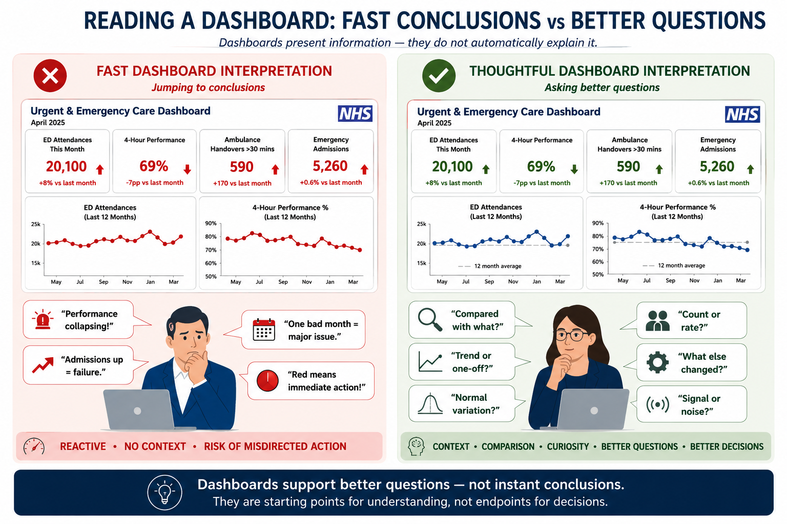
Good dashboard interpretation focuses less on immediate conclusions and more on:
context, comparison, variation and critical questioning
Dashboards help surface patterns and areas requiring attention.
However:
interpretation still requires context, judgement and questioning
Before moving on, consider:
Am I reacting to the dashboard — or interpreting it?
Mistake 4 — Ignoring Denominators
Another common mistake is focusing only on raw numbers.
A dashboard may show:
50 emergency admissions from care homes
Question:
Is this high or low?
The answer depends on:
- how many care home residents exist
- the size of the older population
- expected baseline utilisation
- comparison with peers
Without this context:
raw numbers become difficult to interpret.
Similarly:
40 inpatient falls
might initially feel alarming.
But interpretation changes dramatically if this occurred across:
500 admissions
versus:
25,000 occupied bed days
This matters for:
- admissions
- complaints
- mortality
- harm incidents
- screening uptake
- readmissions
- pathway conversion
Raw numbers alone rarely tell the full story.
Good dashboard interpretation therefore asks:
Relative to what?
Mistake 5 — Assuming Correlation Means Causation
This links back to:
Module 3 — Correlation vs Causation
Dashboards frequently show things moving together.
For example:
ED attendance ↑
4-hour performance ↓
Question:
Did one cause the other?
Maybe.
But dashboards alone rarely prove causation.
Other factors may contribute:
- staffing
- flow delays
- bed occupancy
- discharge delays
- seasonal illness
A dashboard may show:
association
without proving:
cause
Good interpretation asks:
What else might explain this pattern?
Reflection
Before moving on, ask:
If a dashboard suddenly looked concerning, what questions would I want answered before acting?
Good dashboard interpretation begins with curiosity rather than immediate conclusions.
Dashboards become most useful when they encourage:
better questions rather than faster conclusions
rather than immediate conclusions.
Good dashboard interpretation is not about memorising metrics.
Instead:
it is about learning how to think critically about what the dashboard might — and might not — be telling us
The following questions can provide a practical framework for interpreting dashboards more effectively.
1. What Am I Actually Looking At?
Before interpreting a metric, it helps to understand:
what the measure actually represents
For example:
is it:
- a count?
- a rate?
- a percentage?
- an average?
- a median?
- a target?
- a trend?
This matters.
A dashboard may show:
Emergency admissions ↑Question:
Compared with what definition?
Does this include:
- same-day emergency care?
- observation activity?
- short stay admissions?
- only non-elective inpatient spells?
Similarly:
a dashboard may show:
Average waiting timeQuestion:
Average according to whom?
Mean?
Median?
90th percentile?
The same label can sometimes describe very different things.
A useful first question therefore becomes:
What exactly am I looking at?
2. Compared With What?
Numbers rarely mean much in isolation.
A dashboard showing:
72%immediately prompts another question:
Compared with what?
Possible comparisons include:
- previous month
- previous year
- peer organisations
- national average
- target or threshold
- expected seasonal pattern
- statistical control limits
For example:
ED performance may appear poor.
However:
if all peer systems experienced winter deterioration during the same period:
the interpretation changes.
Similarly:
an increase in emergency admissions may feel alarming.
But interpretation changes if:
demand increased nationally
or:
population need increased substantially.
Good dashboard interpretation asks:
Is this number unusual — or expected?
3. Is This Meaningful Change — or Normal Variation?
Healthcare systems fluctuate.
Not every change matters.
A common mistake is assuming:
performance changedtherefore:
something important happenedSometimes this is true.
Sometimes it is simply:
normal variation
For example:
a dashboard may show:
ED attendances ↑ 4%Question:
Is this meaningful?
Good interpretation asks:
- Is this one month or a sustained trend?
- Does the change exceed normal fluctuation?
- What does the SPC chart suggest?
- Has seasonality been considered?
The key question becomes:
Are we observing signal — or noise?
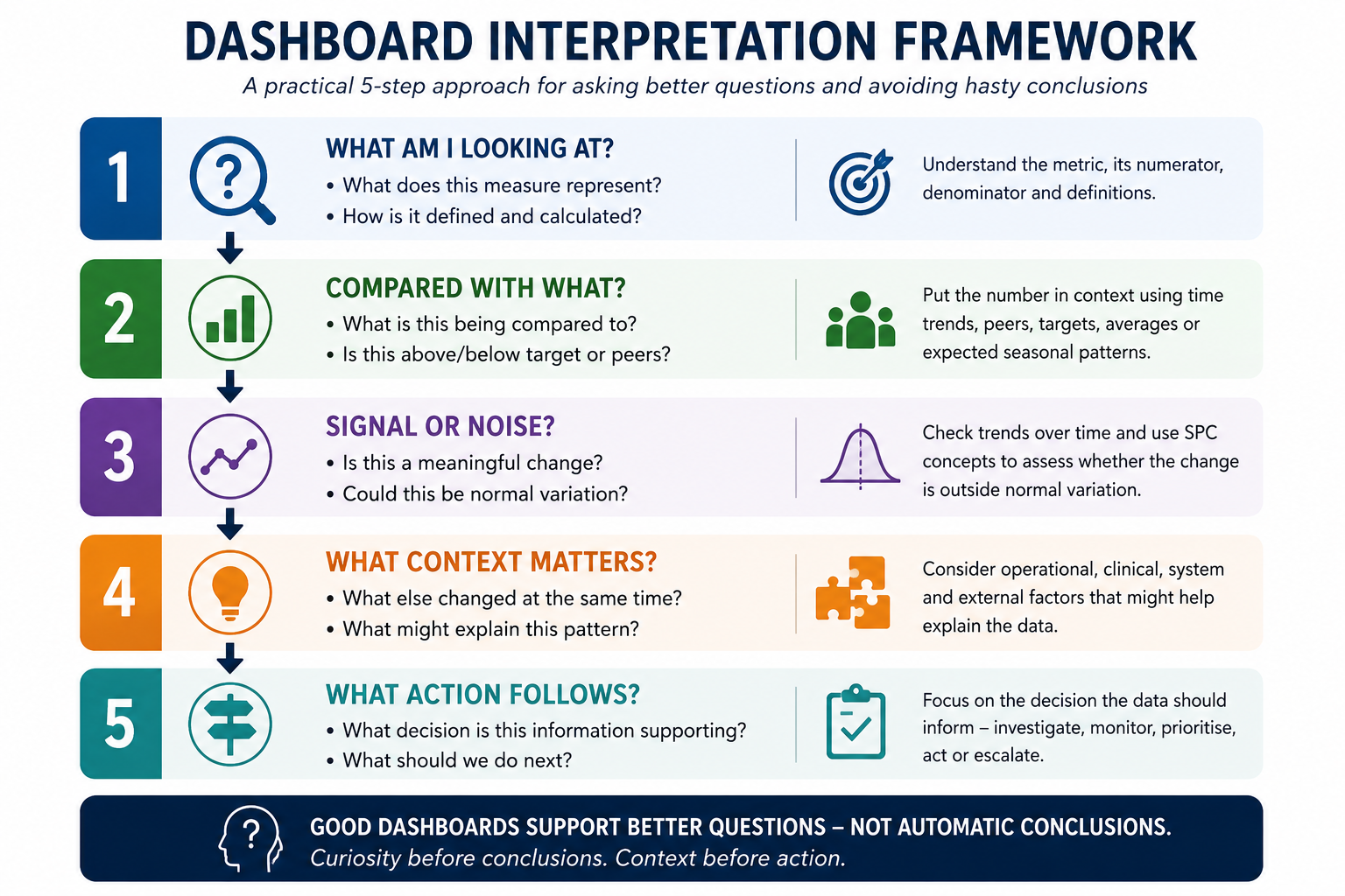
The framework below summarises a practical way to interpret dashboards before jumping to conclusions.
Rather than reacting immediately to a metric or colour:
pause, question and interpret.
4. What Context Might Explain This?
Dashboards rarely explain:
why
something happened.
Context matters.
For example:
a deterioration in urgent care performance may reflect:
- winter respiratory illness
- workforce shortages
- discharge delays
- bed occupancy
- industrial action
- increased acuity
- coding or operational changes
Similarly:
an apparent improvement may not always mean:
improvement caused by intervention.
Good interpretation therefore asks:
What else changed at the same time?
This links closely with:
Module 7 — Thinking About Evidence & Evaluation
because dashboard interpretation should avoid:
jumping from association to causation.
5. What Decision Does This Information Support?
Perhaps the most important question is:
What decision are we trying to make?
Not every metric needs action.
Not every deterioration requires escalation.
And not every improvement should trigger celebration.
A dashboard should help support:
- prioritisation
- investigation
- monitoring
- resource allocation
- quality improvement
- escalation where appropriate
Good interpretation therefore asks:
What decision does this information meaningfully support?
Sometimes the right answer is:
monitor more closely
rather than:
act immediately
Reflection
Before acting on dashboard information, pause and ask:
What am I actually looking at, compared with what, and what context might explain it?
Good dashboard interpretation moves from:
seeing numbers
to
thinking critically about meaning
A Simple Dashboard Interpretation Checklist
Before acting, ask:
- What am I looking at?
- Compared with what?
- Signal or noise?
- What context matters?
- What decision does this support?
Key Takeaways
- dashboards present information — they do not automatically explain it
- numbers rarely make sense without context or comparison
- variation matters — not every change is meaningful
- dashboards show patterns but rarely prove causation
- good interpretation focuses on questioning before action
Effective dashboard interpretation moves beyond:
What happened?
to ask:
What might explain this — and what should we do next?
Questions Decision-Makers Should Ask
Before acting on dashboard information, ask:
- What am I actually looking at?
- Compared with what?
- Is this signal or normal variation?
- What context might explain this?
- What decision does this information support?
- What additional information would improve confidence?
Dashboards are most valuable not when they provide answers — but when they help decision-makers ask better questions.