Module 3 — Correlation vs Causation
Why relationships in healthcare data are rarely straightforward
When two things move together, does one cause the other?
Healthcare analytics frequently identifies relationships between variables.
For example:
- higher deprivation and worse health outcomes
- frailty and increased admissions
- obesity and diabetes
- delayed discharge and longer Length of Stay
- smoking and stroke incidence
When two variables appear related, this is known as a correlation.
However, correlation alone does not prove that one variable directly causes the other.
This distinction matters enormously in healthcare analytics because healthcare systems are complex, interconnected and influenced by many overlapping factors.
What Is Correlation?
Imagine we observe:
| Area | Fast-food density | Obesity |
|---|---|---|
| Area A | Low | Low |
| Area B | High | High |
We might conclude:
fast-food outlets directly cause obesity
But what else may matter?
- income
- access to healthy food
- physical activity
- deprivation
- housing
- education
The relationship may be real — but the pathway behind it is often more complex than it first appears.
Correlation describes a relationship between two variables.
For example:
| Observation | Relationship |
|---|---|
| Areas with higher deprivation often have higher stroke mortality | Positive correlation |
| Increased physical activity is associated with lower cardiovascular risk | Negative correlation |
Correlation helps us:
- identify patterns
- detect variation
- generate hypotheses
- prioritise investigation
But correlation alone cannot tell us:
- why the relationship exists
- whether the relationship is direct
- whether other factors are involved
Correlation Does Not Automatically Mean Causation
Suppose we observe:
| Area | Stroke Mortality |
|---|---|
| Most deprived areas | Higher |
| Least deprived areas | Lower |
It may be tempting to conclude:
“Deprivation directly causes higher stroke mortality.”
However, healthcare outcomes are rarely driven by a single factor.
Deprivation may instead be linked to:
- higher smoking prevalence
- hypertension
- obesity
- diabetes
- delayed healthcare access
- poorer housing
- reduced access to prevention
- increased multimorbidity
- environmental factors
In reality, deprivation often acts as a marker for a wider set of underlying risks and system pressures.
Example — Stroke Outcomes and Inequalities
Stroke outcomes often vary significantly between populations.
For example, more deprived populations may experience:
- higher stroke incidence
- earlier onset of stroke
- increased mortality
- longer rehabilitation needs
- poorer long-term outcomes
However, these differences are usually influenced by multiple interconnected factors including:
- prevalence of hypertension
- smoking rates
- access to primary care
- anticoagulation gaps in atrial fibrillation
- housing and social conditions
- delayed presentation to services
- rehabilitation access
- transport and geography
This means:
the observed inequality is real, but the pathway causing it is complex.
The example below illustrates how healthcare inequalities often emerge through multiple interconnected risk factors rather than a single direct cause-and-effect relationship.
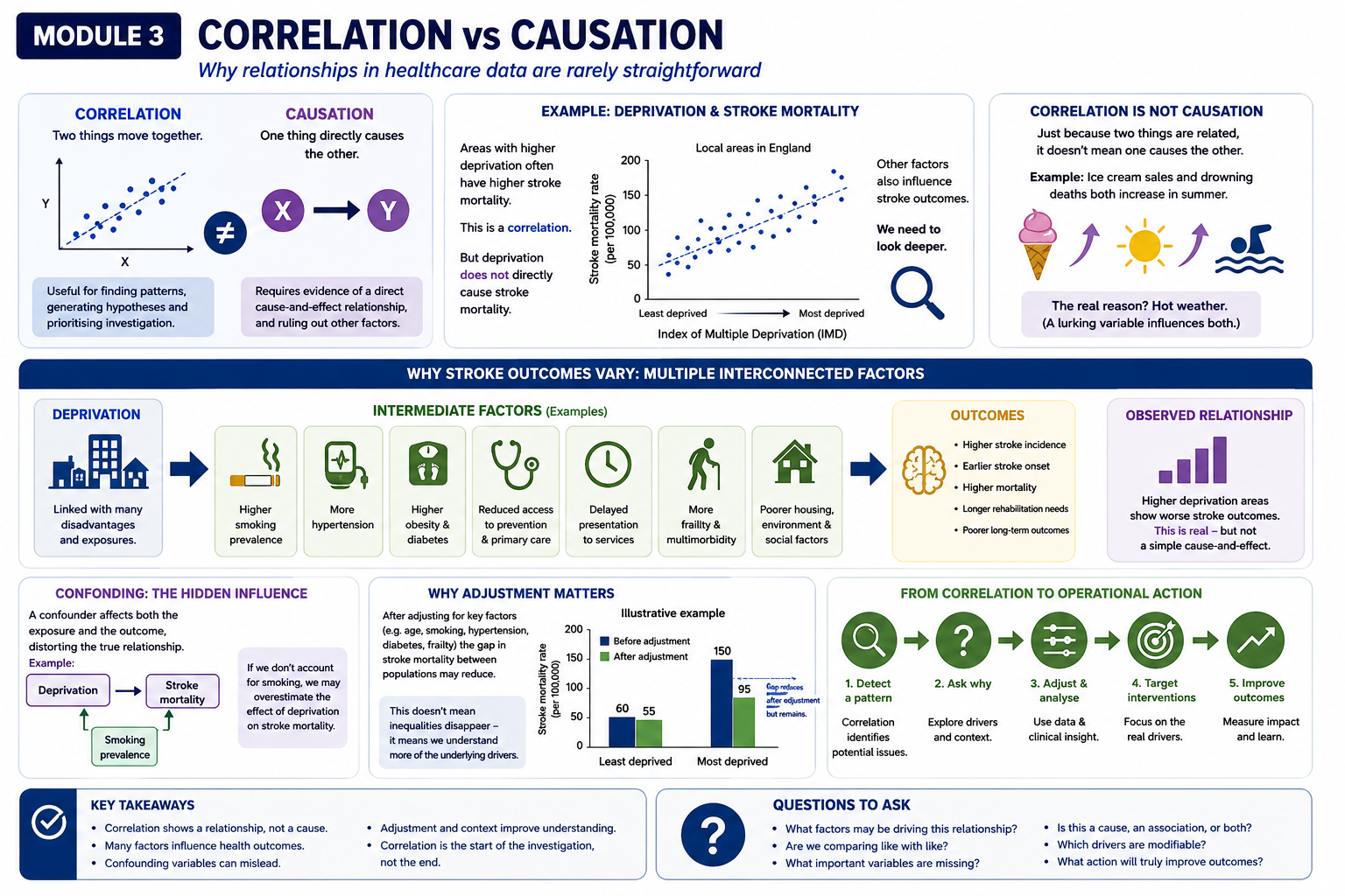
Poor Interpretation vs Better Interpretation
Observed:
higher deprivation → higher stroke mortality
Poor interpretation:
“Deprivation causes stroke.”
Better interpretation:
“Deprivation is associated with a set of behavioural, environmental, biological and access-related risks that may contribute to stroke outcomes.”
Confounding Variables
A confounding variable is a factor that influences both variables being studied.
For example:
For example:
Deprivation
      ↓
Smoking prevalence
      ↓
Stroke risk
If smoking prevalence is not considered, we may overestimate the direct effect of deprivation alone.
Healthcare datasets often contain many confounding variables simultaneously.
This is one reason why interpreting healthcare analytics requires caution.
Why Adjustment Matters
Healthcare analytics often uses adjustment methods to improve fairness and interpretation.
Examples include:
- age standardisation
- case-mix adjustment
- regression modelling
- risk adjustment
Adjustment helps us ask:
“What would outcomes look like if populations were more comparable?”
For example, after adjusting for:
- age
- smoking
- hypertension
- diabetes
- frailty
…the gap in stroke mortality between populations may reduce substantially.
This does not mean inequalities disappear.
It means:
part of the observed relationship was explained by other linked factors.
Adjustment improves understanding — it does not remove complexity.
Looking Deeper
If interested, see:
Appendix — How Adjustment Works
for a more detailed explanation of adjustment approaches used in healthcare analytics.
Correlation Can Still Be Extremely Useful
Importantly:
correlation is not “bad”.
Correlation is often the starting point for:
- identifying inequalities
- detecting unwarranted variation
- prioritising interventions
- operational investigation
- pathway redesign
Without correlation analysis:
- many healthcare inequalities would remain hidden.
The key is understanding that:
correlation should start questions, not end them.
Operational Implications
Misinterpreting correlation as causation can lead to:
- simplistic conclusions
- ineffective interventions
- unrealistic targets
- inappropriate benchmarking
For example:
If analysis shows:
- higher ED attendance in deprived areas
…the operational response should not simply be:
“reduce ED demand.”
Instead, systems may need to examine:
- primary care access
- prevention services
- frailty support
- transport barriers
- community capacity
- housing instability
- proactive care pathways
This moves analytics from:
- descriptive reporting towards:
- operational understanding and intervention.
From Correlation to Operational Action
Effective healthcare analytics often follows this progression:
| Step | Purpose |
|---|---|
| Correlation | Detect a signal |
| Identify drivers | Explore explanations |
| Adjustment | Improve interpretation |
| Cohort segmentation | Identify who is affected |
| Operational targeting | Focus intervention |
| Pathway redesign | Improve outcomes |
This is where healthcare analytics becomes most valuable — moving from observation to better intervention design.
Why Healthcare Data Is Particularly Complex
Healthcare outcomes rarely arise from a single cause.
Instead:
- multiple factors interact
- pathways overlap
- operational context matters
This is why healthcare analytics requires:
interpretation, context and operational understanding — not statistical outputs alone
Key Takeaways
- Correlation describes relationships between variables
- Correlation alone does not prove causation
- Correlation should start questions, not end them
- Healthcare inequalities are usually driven by multiple interacting factors
- Confounding variables can distort interpretation
- Adjustment helps improve fairness and understanding
- Correlation remains extremely valuable for identifying patterns and prioritising investigation
- Healthcare analytics should support better questions, not simplistic conclusions
Questions Decision-Makers Should Ask
When reviewing correlated healthcare metrics:
- What factors may sit behind this relationship?
- Are important confounding variables being missed?
- Does this represent causation, association, or both?
- Are populations truly comparable?
- What operational factors influence these outcomes?
- Which drivers are actually modifiable?
- What intervention opportunities exist?
- What additional analysis is needed before acting?