Module 2 — Mean vs Median
Why Averages Can Hide Operational Reality
What Can an Average Mean?
In healthcare analytics, averages are everywhere.
We regularly see:
- average Length of Stay (LoS)
- average waiting times
- average cost per patient
- average ED attendances
- average theatre utilisation
Averages are useful because they simplify complex information into a single number that is easy to communicate and compare.
But healthcare systems are rarely “average”.
Behind a single average often sits:
- significant variation
- operational complexity
- long-tail demand
- very different patient experiences
Averages simplify reality — but they can also obscure it.
Why This Matters in Healthcare
Suppose two Trusts report the following:
| Trust | Average Length of Stay |
|---|---|
| Trust A | 5.1 days |
| Trust B | 7.2 days |
At first glance, Trust B may appear less efficient.
But is that comparison fair?
What if Trust B:
- serves an older population
- has higher frailty prevalence
- has more patients with multiple long-term conditions
- experiences delayed discharges due to social care pressures
- operates a tertiary specialist service
- has limited community capacity
The average alone does not tell us this.
This is one of the most important principles in healthcare analytics:
Averages summarise data — but they do not explain it.
Mean vs Median
Two commonly used “averages” are:
| Measure | What it represents |
|---|---|
| Mean | The arithmetic average across all patients |
| Median | The middle patient when values are ordered |
The mean is sensitive to extreme values (outliers).
The median is often more stable and better reflects the “typical” patient experience.
Why Mean and Median Diverge
Imagine ten patients stay in hospital for:
2, 2, 2, 3, 3, 3, 4, 5, 6, 35Most patients stay only a few days.
But one very long-stay patient changes the average dramatically.
| Measure | Result |
|---|---|
| Mean | 6.5 days |
| Median | 3 days |
The median helps understand the typical patient. The mean helps understand overall system burden and resource use.
In healthcare:
both matter — but for different reasons
Example — Length of Stay (LoS)
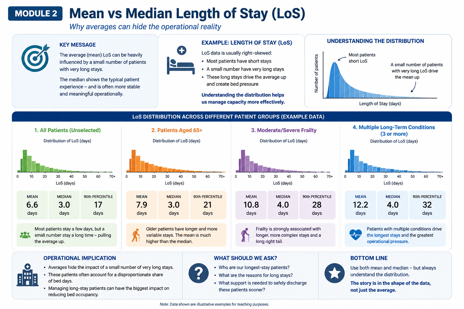
Length of Stay data is usually heavily right-skewed. The example below shows how mean and median can diverge across different patient groups.
This means:
- most patients stay a relatively short time
- a small number stay much longer
- those long stays pull the mean upward
For example:
| Patient Group | Mean LoS | Median LoS |
|---|---|---|
| All Patients | 6.6 days | 3 days |
| Patients aged 65+ | 7.9 days | 3 days |
| Moderate/severe frailty | 10.8 days | 4 days |
| Multiple long-term conditions | 12.2 days | 4 days |
The median patient may stay only a few days.
However, a relatively small number of long-stay patients can account for a disproportionate number of occupied bed days.
Operationally, this matters enormously.
The figure below illustrates why mean and median may tell very different stories in healthcare operational data.
Notice something important:
median LoS changes relatively little, while mean LoS increases substantially as complexity and frailty rise.
This suggests a relatively small number of patients may be driving disproportionate bed occupancy.
Why The Distribution Matters
If we only report the mean:
- we lose visibility of variation
- we may miss operational bottlenecks
- we may misunderstand where pressure originates
Understanding the full distribution helps answer more meaningful operational questions:
- Who are our longest-stay patients?
- Why are stays prolonged?
- Which patients drive bed occupancy?
- Are delays clinical, social or pathway-related?
- Where would interventions have the greatest operational impact?
Sometimes:
the story is in the shape of the data, not just the average.
Is It Fair To Compare Trusts or ICBs Using Averages?
Averages support benchmarking — but only with context.
Simple comparison may overlook:
- population need
- frailty burden
- pathway complexity
- social care pressures
This is why benchmarking should support questions and learning rather than simplistic league tables.
(We explore fair comparison in more depth in Module 5.)
Benchmarking in Practice — Model Hospital
NHS England’s Model Hospital (Model Health System) uses many averages and benchmark metrics including:
- average LoS
- theatre utilisation
- productivity metrics
- operational performance indicators
However, Model Hospital also attempts to improve fairness by using:
- peer-group comparisons
- specialty-level analysis
- segmentation
- contextual benchmarking
This reflects an important reality:
Healthcare operational benchmarking is inherently complex.
No single metric tells the whole story.
Operational Implications
Averages remain useful.
They help organisations:
- summarise performance quickly
- benchmark over time
- identify broad variation
But averages alone should rarely drive operational decisions.
Waiting Time Example
An average waiting time of:
4 weeks
may sound acceptable.
But if:
- most patients wait 1–2 weeks
- a smaller group waits 30+ weeks
the average hides an important operational problem.
The average waiting time may look acceptable.
But the patient experience — and operational risk — may not be.
Again:
the shape of the distribution matters.
Key Takeaways
- The mean and median measure different aspects of a population
- Healthcare data is often skewed rather than normally distributed
- A small number of patients can drive disproportionate operational pressure
- The median often reflects the “typical” patient experience, while the mean better reflects system burden
- The distribution may matter more than the average itself
- Fair comparison requires context, not just metrics
- Benchmarking should start conversations, not end them
Questions Decision-Makers Should Ask
When reviewing averages:
- What does this average actually represent?
- How variable is the underlying data?
- Are there important outliers?
- Are populations comparable?
- What operational factors sit behind the numbers?
- Does the distribution reveal something the average hides?
- What action is realistically possible?