Module 5 — Standardisation & Fair Comparison
Healthcare organisations often compare: - admission rates - mortality - ED attendance - stroke outcomes - Length of Stay
But populations are rarely directly comparable.
- Some areas are older.
- Some experience greater deprivation.
- Some have higher frailty or multimorbidity.
This creates an important challenge:
How can we compare healthcare outcomes fairly without losing sight of operational reality?
Why do we adjust healthcare data?
Adjustment attempts to account for these differences so comparisons become fairer and more meaningful.
Age Adjustment
Age-specific rate
An age-specific rate is calculated separately for each age group:
\[ \text{Age-specific rate} = \frac{\text{Stroke deaths in age group}} {\text{Population in age group}} \times 100,000 \]
Example calculation:
\[ \frac{120}{50,000} \times 100,000 = 240 \text{ per 100,000} \]
This allows comparison within similar age groups.
Direct age-standardised rate
Age-standardisation applies a standard population structure to both populations:
\[ \text{Age-standardised rate} = \frac{ \sum(\text{age-specific rate} \times \text{standard population}) }{ \sum(\text{standard population}) } \]
This answers:
“What would the outcome rate look like if both populations had the same age structure?”
Which Standard Population Should We Use?
Age-standardisation requires the use of a standard population structure.
In England, the most commonly used standard population is the:
European Standard Population (ESP2013)
This provides a consistent age distribution that allows fairer comparison between populations with different age structures.
However, the choice of standard population matters.
The ESP2013 is widely used because it:
- supports consistency across analyses
- enables comparison between regions and countries
- removes some of the influence of differing age structures
This is particularly useful for:
- mortality comparisons
- public health analysis
- disease incidence rates
- long-term trend analysis
Important Limitation
The ESP2013 is an artificial reference population.
It does not necessarily reflect:
- the actual age structure of England
- local ICB populations
- operational healthcare demand
Statistical comparability does not always equal operational comparability.
Example — Older Populations
Suppose:
- ICB A has a substantially older population
- ICB B has a younger working-age population
After age-standardisation:
their rates may appear more similar
However:
ICB A may still experience significantly greater operational pressure due to: * frailty * multimorbidity * discharge complexity * higher service utilisation
This highlights an important distinction:
Comparable performance does not imply equal opportunity for improvement.
When National Population Structures May Be Useful
In some operational analyses, national population distributions or age-specific rates may provide a more realistic reflection of healthcare demand.
may provide a more realistic reflection of expected healthcare demand.
This can be particularly relevant when analysing:
- specific age cohorts
- service planning
- operational capacity
- demand forecasting
For example:
- ED attendance rates for people aged 75+
- frailty prevalence
- community service utilisation
In these situations:
- age-specific operational demand may matter more than fully standardised comparison.
Operational Interpretation Matters
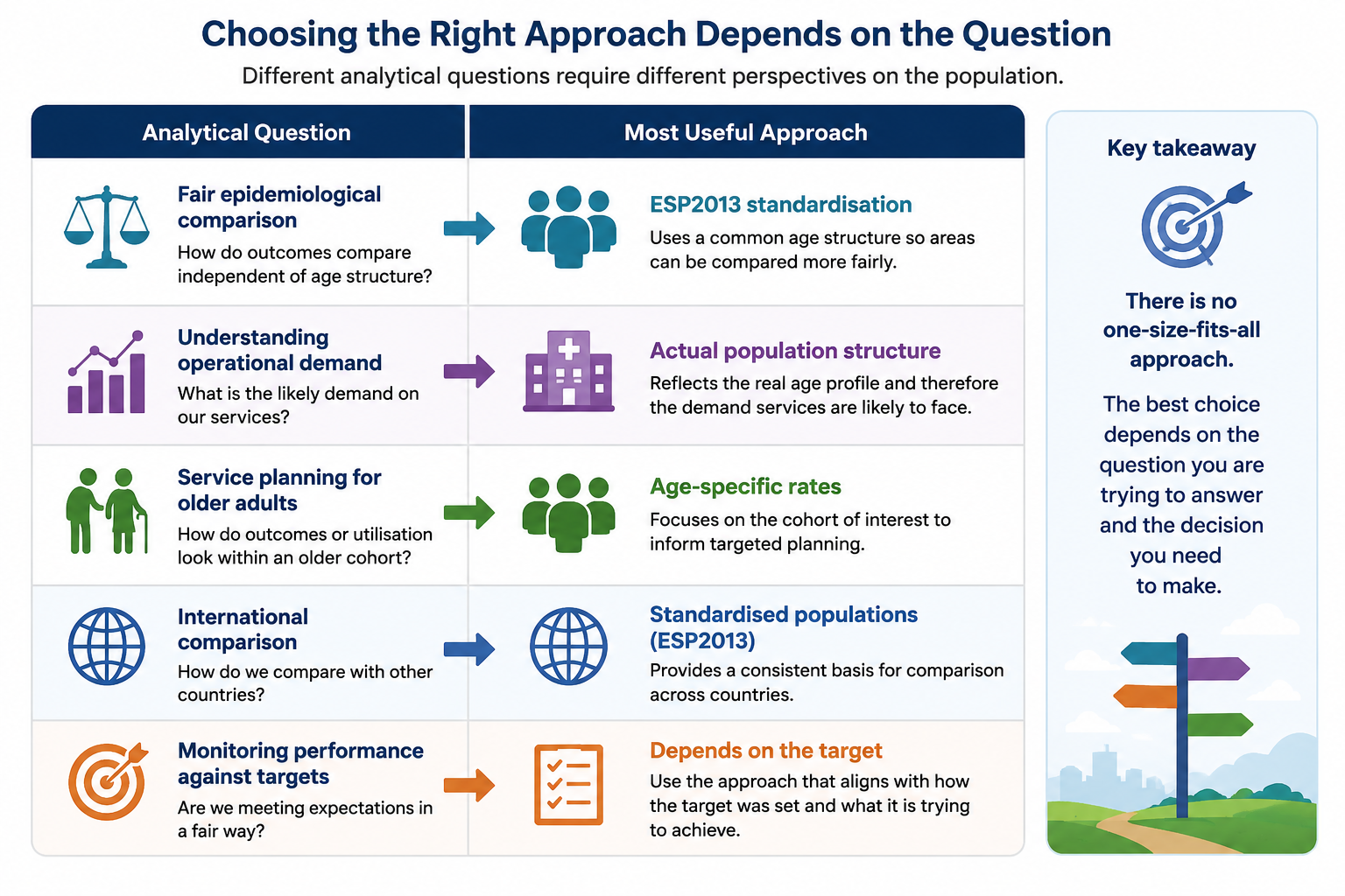
Neither approach is universally “correct”.
The appropriate approach depends on the question being asked. For example:

Adjustment Using Regression Models
Standardisation is one approach to improving fairness in comparison.
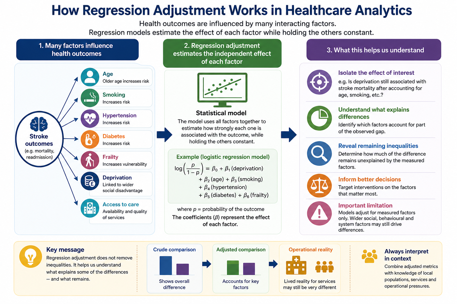
Healthcare analytics may also use statistical models to adjust simultaneously for multiple interacting factors.
For example:
- age
- smoking
- hypertension
- diabetes
- frailty
may all influence stroke outcomes simultaneously.
Frailty Adjustment
Frailty can be represented in several ways:
- frailty score
- mild/moderate/severe frailty categories
- electronic frailty index (EFI)
Example model:
\[ \begin{aligned} \log\left(\frac{p}{1-p}\right) &= \beta_0 \\ &+ \beta_1(\text{deprivation}) \\ &+ \beta_2(\text{age}) \\ &+ \beta_3(\text{smoking}) \\ &+ \beta_4(\text{hypertension}) \\ &+ \beta_5(\text{diabetes}) \\ &+ \beta_6(\text{frailty}) \end{aligned} \]
This estimates whether deprivation still appears associated with stroke mortality after accounting for these additional risk factors.
The diagram below illustrates how regression adjustment attempts to account for multiple interacting factors simultaneously when analysing healthcare outcomes.
Fair Comparison Does Not Always Mean Fair Operational Expectations
Adjustment does not “remove” inequalities.
Instead, it helps us understand:
- which factors may explain part of the observed difference
- which inequalities remain after accounting for measurable risk factors
For example:
Before adjustment:
Stroke mortality may appear substantially higher in deprived populations.
After adjustment:
Some of the gap may reduce because smoking, hypertension, diabetes and frailty explain part of the difference.
However:
a remaining gap may still exist due to wider social, behavioural and healthcare inequalities.
Even after adjustment, statistically fair comparison does not necessarily imply equal operational opportunity.
For example:
should two ICBs with similar ED attendance rates be expected to achieve the same reduction target?
Often:
no
Identical percentage reductions assume the same underlying opportunity, risk profile and pathway flexibility.
That is rarely true.
This is where healthcare systems move from simple benchmarking towards population-adjusted operational planning.
Why This Matters
Imagine:
| ICB | Population Profile |
|---|---|
| ICB A | Younger, urban, lower frailty |
| ICB B | Older, rural, higher frailty |
Even after using age-specific ED attendance rates, the systems may still differ because of:
- deprivation
- multimorbidity
- access to primary care
- transport
- care home prevalence
- community service availability
- rurality
- ambulance conveyance patterns
- social care capacity
So:
a 10% reduction target may be much more achievable in one system than another.
Example:
| ICB A | ICB B | |
|---|---|---|
| Population | Younger / urban | Older / rural |
| 65+ ED rate | 8,000 | 8,200 |
| Likely drivers | Pathway gaps | Frailty / care homes |
| Opportunity for reduction | Higher | Lower |
Similar rates. Very different operational reality.
A blanket:
“reduce by 10%”
implicitly assumes equal reducibility.
That’s often false.
More Realistic Approaches to Improvement
Understand Reducible vs Non-Reducible Demand
Some ED activity is:
- clinically appropriate
- structurally unavoidable
- demographically driven
Some is potentially avoidable.
Operationally, the focus should be:
- avoidable admissions
- ambulatory-sensitive conditions
- pathway gaps
- delayed community response
- repeat attendance cohorts
rather than crude overall reductions alone.
Segment by Cohort
Better targets are often cohort-specific:
| Cohort | Better Target |
|---|---|
| Frailty | reduce avoidable conveyances |
| LTCs | improve proactive management |
| Frequent attenders | reduce repeat attendances |
| Care homes | improve in-place care |
| Children | improve same-day access |
Improvement Opportunity Matters
Two ICBs may have:
- similar rates
- different pathway maturity
Similar performance does not imply equal opportunity for improvement.
Better Questions Than “Can Both Reduce by 10%?”
Ask:
- What proportion is avoidable?
- Which cohorts drive growth?
- Which attendances are pathway-sensitive?
- What operational levers exist?
- What capacity exists outside ED?
- What does good look like for similar systems?
- What inequities are driving demand?
Fair Comparison ≠ Fair Operational Expectations
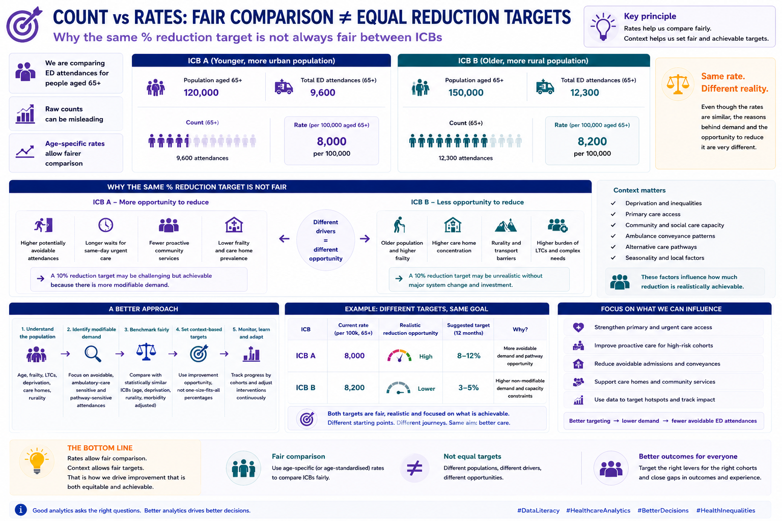
The diagram below illustrates a key principle:
fair comparison does not automatically imply equal operational opportunity
Even where rates appear comparable, factors such as frailty, deprivation, pathway maturity and community capacity may influence achievable improvement.
Key Takeaways
Adjustment improves fairness and interpretation.
But healthcare systems remain complex.
Even sophisticated adjustment models cannot fully capture:
- social context
- behavioural factors
- housing
- service access
- operational pressures
- community support capacity
This is why:
healthcare analytics should support thoughtful interpretation, not simplistic conclusions.
A Key Question
Have we made a genuinely fair comparison — or simply made the numbers look more comparable?
For example:
two systems may show similar age-standardised rates while still experiencing very different levels of frailty, discharge complexity and service pressure.
That is the central tension in healthcare analytics: fair comparison does not automatically imply comparable operational reality.
Questions Decision-Makers Should Ask
- Could standardisation be masking genuine operational pressure?
- Are we interpreting statistical fairness as operational fairness?
- Does the adjustment method fit the question being asked?
- Are we trying to understand epidemiological risk, operational demand, or both?
- Would peer comparison be fairer than national comparison?
- What important context remains unmeasured?
- Could inequalities still be hidden within subgroups?
- Are equal targets operationally realistic across different systems?