Module 4 — Variation & Distributions
Module Learning Objective
This module explains why healthcare systems naturally exhibit variation and rarely behave in perfectly predictable ways — and why understanding variation is often more important than understanding averages.
Why Looking at the Data Matters
Healthcare analytics often relies on summary statistics such as:
- averages (means)
- medians
- percentages
- rates
- standard deviations
These measures are useful because they simplify complex data.
However, summary statistics can sometimes be misleading.
Very different underlying patterns may produce:
- the same mean
- similar variation
- similar summary statistics
while representing very different operational realities.
This creates an important lesson:
Always look at the shape of the data — not just the summary numbers.
A Statistical Cautionary Tale
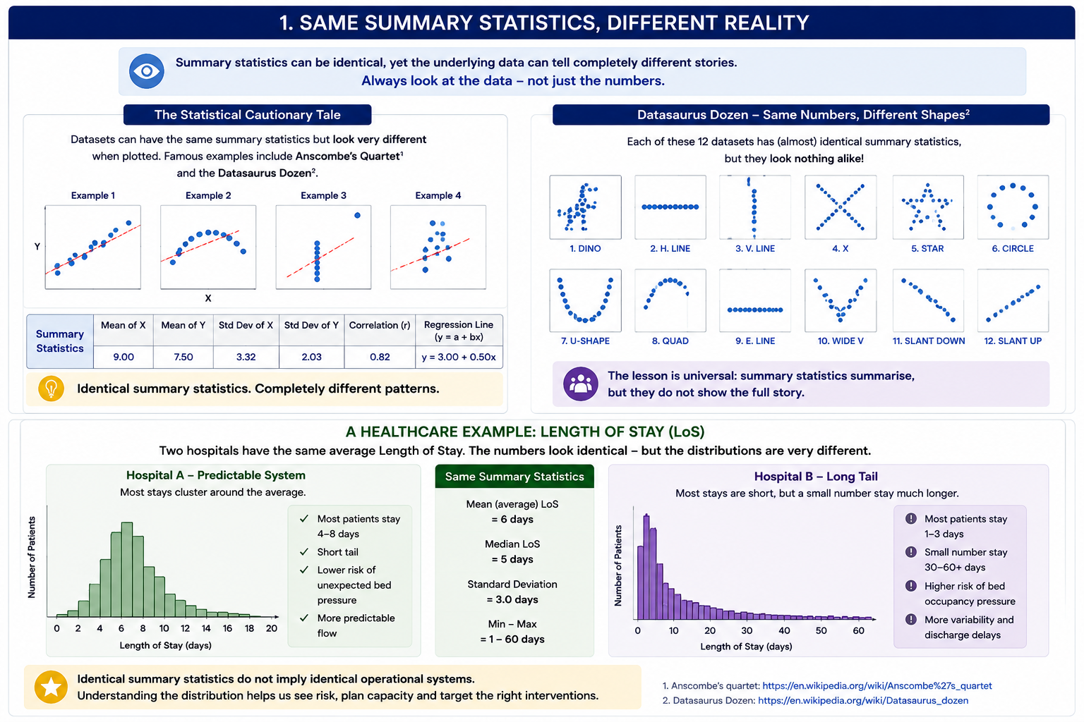
In statistics, there are famous examples showing how datasets can appear almost identical numerically while looking completely different when plotted.
Examples include:
- Anscombe’s quartet https://en.wikipedia.org/wiki/Anscombe%27s_quartet
- Datasaurus Dozen https://en.wikipedia.org/wiki/Datasaurus_dozen
These examples demonstrate a simple but powerful message:
Datasets with similar summary statistics may behave in completely different ways when visualised.
For example:
Two datasets may have:
- the same average
- the same variance
- the same correlation
yet reveal very different patterns when visualised.
One may show:
- a clear trend
while another may contain:
- clusters
- outliers
- hidden non-linearity
- very different distributions
Key Lesson
Numbers summarise data — but plots help us understand it.
A Healthcare Example: Length of Stay
Healthcare data often behaves this way.
Length of Stay provides one of the clearest examples.
Healthcare data often behaves this way.
Length of Stay provides one of the clearest examples.
Two hospitals may report the same average Length of Stay while experiencing very different operational realities.
We return to this example shortly.
Trust A
Most patients stay: 4–8 days
Variation is relatively predictable.
Trust B
Most patients stay: 1–3 days
But a relatively small cohort stays much longer: - 30–60+ days
due to:
- frailty
- multimorbidity
- delayed discharge
- social care complexity
Operationally:
- the systems may feel completely different despite identical averages.
This highlights an important lesson:
identical summary statistics do not imply identical operational systems.
Common Patterns of Variation in Healthcare
Before returning to Length of Stay in more detail, it is useful to understand some common ways healthcare activity behaves statistically. These patterns help explain why healthcare systems rarely behave in smooth or predictable ways.
Normal Distribution
Characteristics:
- symmetrical
- clustered around a central value
- predictable variation
Healthcare examples:
- adult height
- blood pressure (in selected populations)
- laboratory measurements
Interpretation
Variation is relatively predictable.
Right-Skewed Distribution (Most Common in Healthcare)
Characteristics:
- many small values
- fewer large values
- long tail
Healthcare examples:
- Length of Stay
- ED attendances per patient
- outpatient waiting times
- frequent attenders
- delayed discharge
Interpretation
A small number of patients often drive disproportionate operational demand.
Counts & Proportions
Healthcare systems often monitor:
- counts (falls, incidents, infections)
- proportions (% compliance, mortality, readmissions)
These are useful because healthcare activity is often uneven and noisy.
Bimodal Distributions
Characteristics:
- two peaks
Healthcare examples:
- ED waiting times split between minors and majors
- mental health LoS groups
- elective vs emergency pathways
Interpretation
May suggest:
- different patient groups
- hidden segmentation
- pathway effects
Length of Stay (LoS): Looking Beyond the Average
Length of Stay (LoS) is one of the most common healthcare measures used to monitor hospital performance, patient flow and operational pressure.
At first glance, LoS may appear simple:
How long do patients stay in hospital on average?
However, Length of Stay data rarely behaves in a simple or predictable way.
In reality, LoS is often highly skewed.
Most patients may stay for only a short period of time, while a much smaller group experience considerably longer stays.
This creates what is known as a long tail distribution.
For example:
- many patients may stay 1–3 days
- fewer patients stay 7–14 days
- a relatively small number may remain in hospital for 30, 60 or even 90+ days
This means the “average” Length of Stay can sometimes hide what services are actually experiencing operationally.
Understanding Skew and Tails
In a symmetrical distribution, most values cluster evenly around the middle.
Healthcare data often behaves differently.
Length of Stay commonly demonstrates a right-skewed distribution, where:
- many short stays occur
- progressively fewer longer stays occur
- a small number of patients create a long operational tail
The important insight is:
not all patients contribute equally to hospital bed occupancy.
A relatively small number of patients can consume a disproportionate number of bed days.
This matters enormously operationally.
Why Longer stays may occur
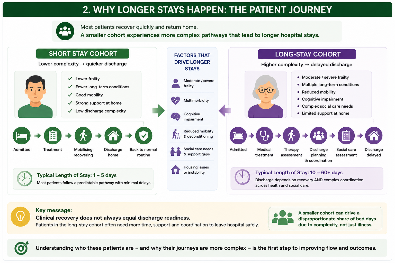
Longer stays are often not random.
They may be disproportionately associated with patients who experience:
- moderate or severe frailty
- multiple long-term conditions (multimorbidity)
- cognitive impairment
- social care needs
- housing instability
- complex discharge requirements
For example:
A relatively fit patient admitted with pneumonia may recover and return home quickly.
In contrast, an older frail patient with:
- heart failure
- diabetes
- dementia
- reduced mobility
may require:
- therapy input
- social care assessment
- discharge planning
- community support coordination
Even if medically fit, discharge may remain delayed due to wider system complexity.
This means Length of Stay is often influenced by much more than clinical recovery alone.
Delayed Discharge and Operational Pressure
Delayed discharge provides an important example of how distributions matter.
Imagine two hospitals with a similar average Length of Stay.
On paper:
Imagine two hospitals:
| Trust | Mean Length of Stay |
|---|---|
| Trust A | 6 days |
| Trust B | 6 days |
The averages look identical.
The averages appear identical.
However:
Trust A
Most patients stay: 4–8 days
Trust B
Most patients stay:
- 1–3 days
But a smaller group experience:
- 30–60+ day stays due to delayed discharge and frailty-related complexity
Operationally, these hospitals may feel very different.
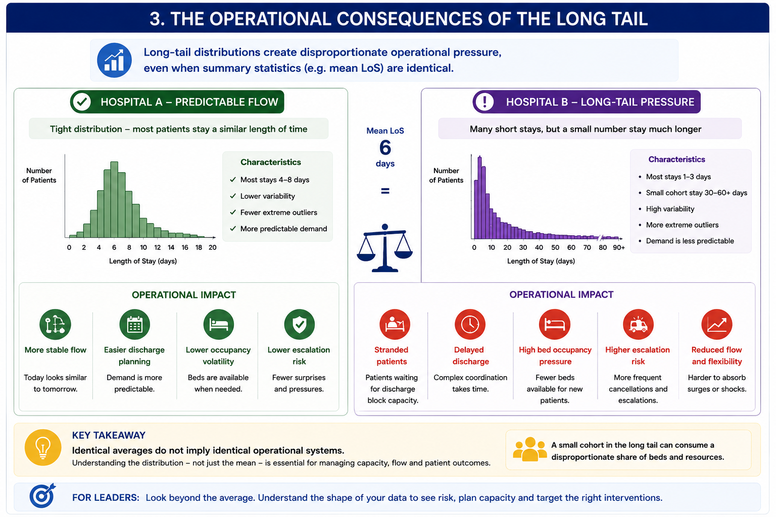
Trust B may experience:
- bed occupancy pressure
- delayed patient flow
- discharge bottlenecks
- corridor care risk
- escalation pressures
even though the average Length of Stay is the same.
This highlights an important lesson:
identical averages do not imply identical operational systems.
Poor Interpretation vs Better Interpretation
Observed:
Mean LoS = 6 days in both trusts
Poor interpretation:
“The hospitals perform similarly.”
Better interpretation:
“The averages are similar, but the underlying distribution and operational pressures may differ substantially.”
Why This Matters for Population Health Management (PHM)
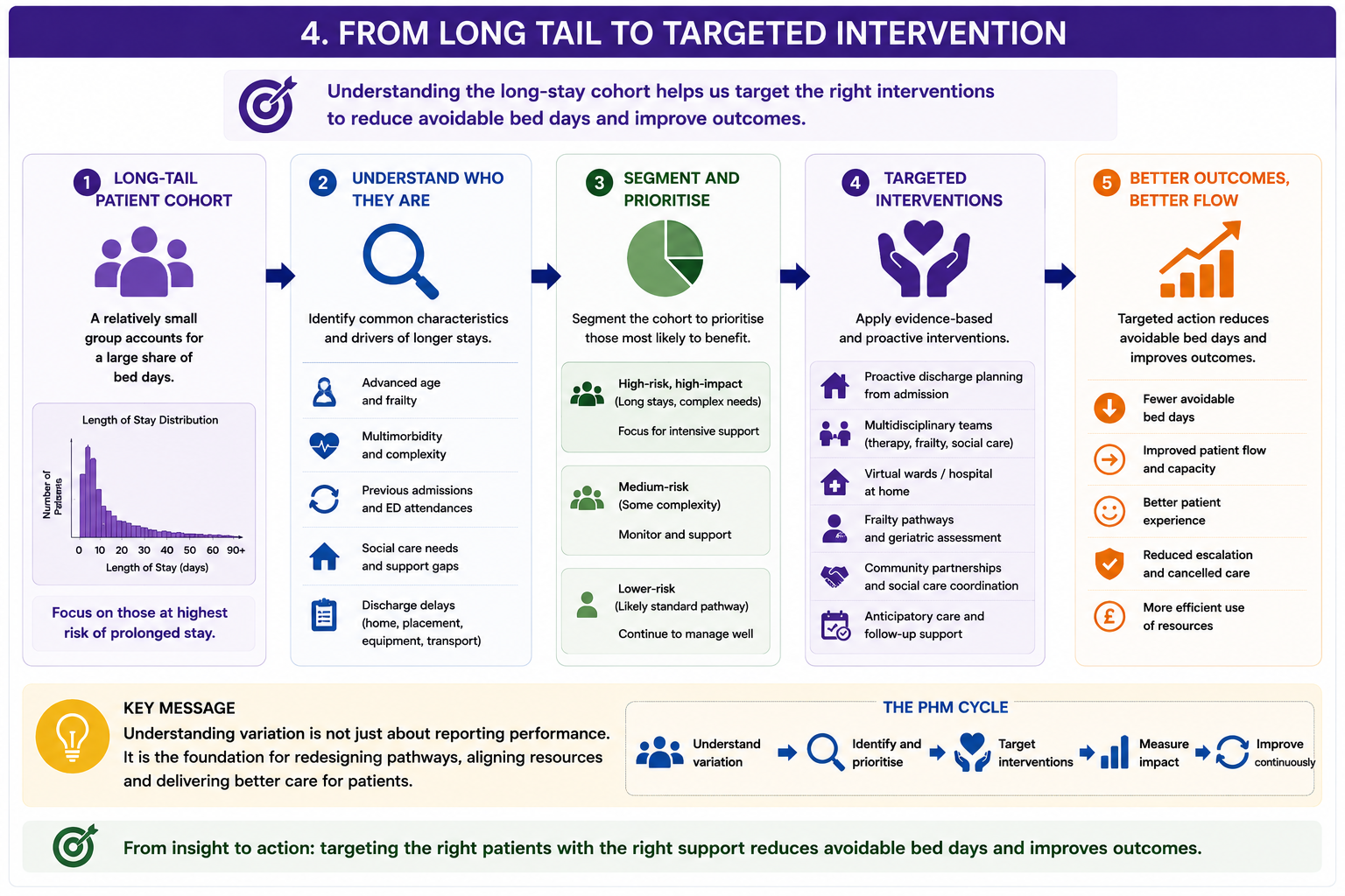
Understanding who sits in the long tail matters.
If a relatively small cohort consumes a large proportion of bed days, important questions emerge:
- Who are these patients?
- What risks or characteristics do they share?
- Are there opportunities for earlier intervention?
- Could support be delivered upstream?
This moves analytics beyond description and into action.
For example:
Healthcare systems may identify cohorts with:
- moderate/severe frailty
- repeated non-elective admissions
- multimorbidity
- social care dependency
- discharge delays
These cohorts may benefit from:
- anticipatory care
- frailty pathways
- integrated neighbourhood working
- enhanced discharge planning
- community-based intervention
Why This Matters for Pathway Redesign and Demand Management
Variation in Length of Stay can reveal where systems are struggling.
The goal is often not simply:
“reduce average Length of Stay”
Instead, the more useful question may be:
“What is driving long stays, and which parts of the pathway can realistically be redesigned?”
Examples might include:
- earlier frailty identification
- improved discharge coordination
- hospital-at-home models
- better rehabilitation pathways
- integrated community support
This is where analytics becomes operationally useful.
Rather than reporting averages alone, healthcare analytics can help answer:
Which patients are driving demand, why, and what can realistically be done differently?
Key Insight
A relatively small cohort may consume a disproportionate share of bed days — and understanding this cohort may unlock some of the greatest opportunities for pathway redesign, prevention and demand management.
Statistical Process Control (SPC) Charts
So far we have explored variation across patients.
What Are SPC Charts?
SPC charts help distinguish:
But healthcare systems also vary over time.
This raises another important question:
is change meaningful — or simply normal fluctuation?
This is where SPC charts help.
common cause variation
(normal system variation)
vs
special cause variation
(unusual change requiring investigation)
This is extremely NHS relevant.
When SPC Charts Work Well
When monitoring:
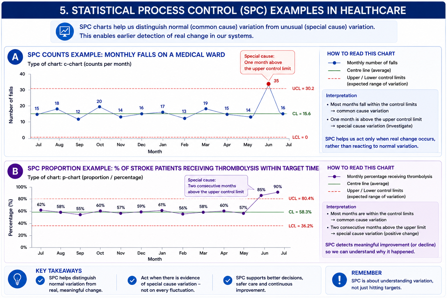
Counts (c-chart/u-chart)
Example:
- falls per ward
- complaints
- infections
Proportions (p-chart)
Example:
- % stroke patients thrombolysed
- % patients seen within target
Example: Counts
Monthly falls on Ward A.
Question:
Is variation normal — or has something changed?
Example: Proportion
% stroke patients receiving assessment within target timeframe.
Question:
Are we seeing sustained improvement or random fluctuation?
The examples below illustrate how SPC can help distinguish expected fluctuation from meaningful change in healthcare systems.
When NOT To Use SPC
Important section.
Avoid when:
- tiny numbers
- unstable denominators
- changing definitions
- poor data quality
- major pathway redesign underway
- inappropriate comparisons
And importantly:
SPC does not explain why variation occurred.
It only flags:
something unusual may have happened.
That distinction matters.
Looking Ahead: When Understanding Variation Is Not Enough
Understanding variation helps us interpret healthcare systems.
But sometimes decision-makers need to move beyond:
“What happened?”
and ask:
“What might happen if the system changes?”
Examples include:
- adding ED capacity
- reducing discharge delays
- workforce shortages
- winter demand pressures
- elective backlog recovery
This is where simulation models can help.
Rather than relying only on averages or historical trends, simulation allows healthcare systems to explore:
What might happen under different scenarios?
Simulation will be explored in more detail in a later module in the series.
Key Takeaways
- Healthcare systems naturally exhibit variation — averages rarely tell the whole story
- Summary statistics can look similar while masking very different operational realities
- Understanding distributions helps explain demand, flow and system pressure
- A relatively small cohort of patients may consume a disproportionate share of bed days
- Statistical Process Control (SPC) helps distinguish expected variation from meaningful change
- SPC highlights signals — but does not explain causes
- When systems become highly variable or operationally complex, simulation models may help explore future scenarios
Questions Decision-Makers Should Ask
- Are we looking only at an average — or the full distribution of activity?
- Could a relatively small cohort be driving disproportionate operational pressure or demand?
- Are we seeing expected variation — or evidence of something meaningfully different?
- Is this signal likely to reflect real change or random fluctuation? Would SPC help us distinguish?
- Does this metric hide operational complexity (for example, frailty, delayed discharge or multimorbidity)?
- Are there different patient groups or pathways hidden within the data?
- What operational actions would realistically follow from this analysis?
- Has the system become too complex for averages and trend lines alone?
- Would scenario modelling or simulation help us test future options?